Frontend
shadcn/ui Component Showcase
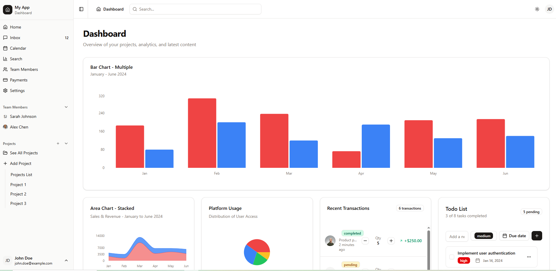
A working application used as a design system proof, rather than a gallery of components sitting on a page.
The problem
Component showcases usually stop at a wall of buttons and inputs. That proves the components render, but not that they hold up. Real interfaces are where design systems break: a data table needs sorting and pagination, a form needs validation and error states, a dashboard needs charts that survive resizing, and every one of those has to work in light and dark mode and on a phone. So the showcase was built as an actual product surface instead of a catalogue.
Approach
- Twelve real routes stand in for a working product: dashboard, projects with detail and creation pages, users with individual profiles, payments, inbox, calendar, search and settings.
- The component library is assembled from twenty-six primitives built on fifteen Radix packages, so accessibility behaviours like focus management and keyboard navigation come from the primitives instead of being reimplemented.
- Data tables, forms and charts are exercised inside those routes with real interactions, which is where sorting, validation and empty states actually get tested.
- The stack is deliberately current: Next.js 15 with React 19, which also makes the project a check on whether the ecosystem libraries keep up.
- Dark mode and responsive behaviour are handled at the design-token level rather than patched per component.
What it proves
- A live application demonstrating twenty-six components across twelve routes, not a static component gallery.
- Accessibility primitives from Radix, kept rather than reimplemented.
- Running on Next.js 15 and React 19.
- Serves as the reusable design-system baseline for starting new projects quickly.
Next.jsTypeScriptshadcn/uiRadix UITailwind CSSReact Hook Form